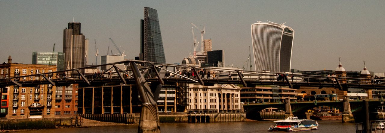
My subjects are often inspired by what other bloggers have published and one of my blogging heroes is the author of the blog A London Inheritance. The author inherited a photographic archive from his father showing London scenes before, during and after the war. In the blog he follows up what those locations look like now along with beautifully illustrated stories of London’s history.
Recently he wrote about this Report published on behalf of the Corporation of London in 1951. It deals in detail with plans conceived by consultants in 1947 for the reconstruction of the City …
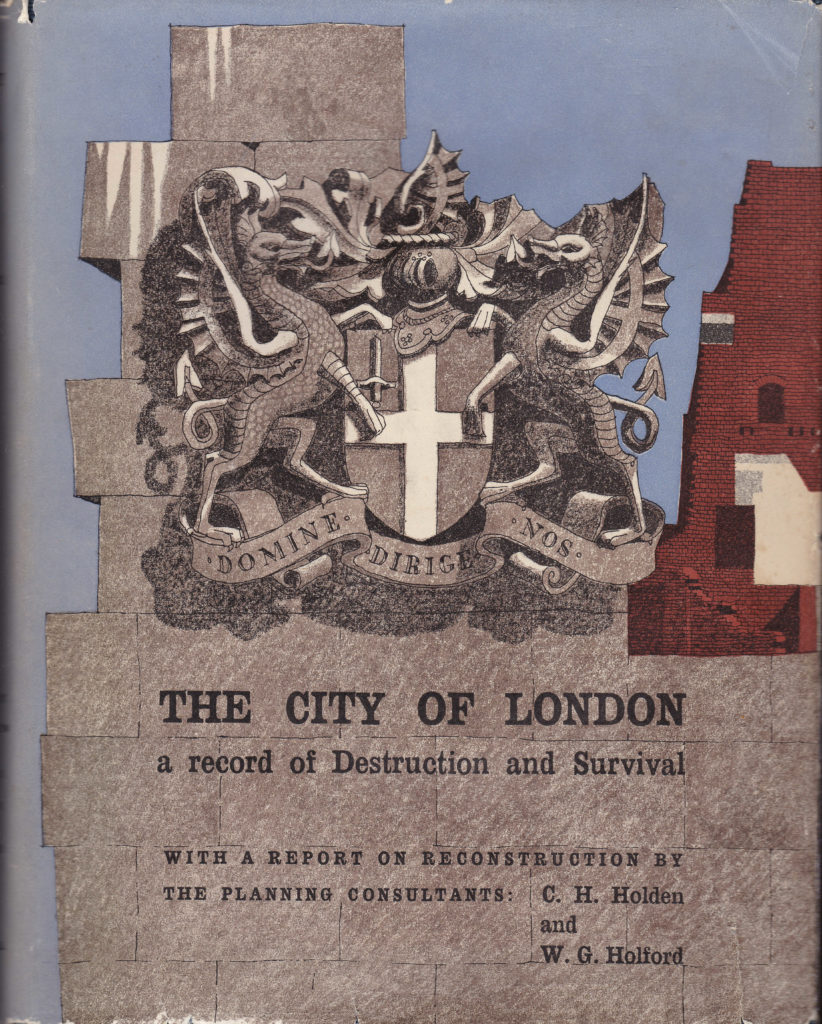
I have taken some extracts from it that I found particularly fascinating but if you want to read the entire blog (and I recommend it highly) here is a link.
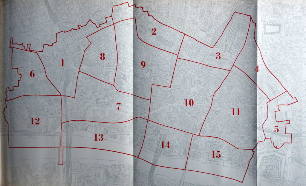
The first illustration that interested me was this Inventory of Accommodation within the City. The present day Barbican Estate falls firmly into section 9 …
The report then goes on to illustrate in this table the total floor space in 1939 along with the percentage destroyed during the War …
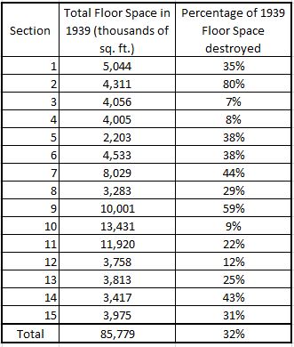
As you can see, the map highlights the considerable amount of damage caused by the early raids of 1940 / 41 when incendiaries caused significant fire damage in the areas around and to the north of St. Paul’s Cathedral as shown by the high percentage figures for blocks 2,7 and 9.
New roads and high and low level separation of pedestrians and vehicles was seen as the way forward for the City. The Barbican Highwalk is a present day example of what the new ‘pedways’ above the traffic might have looked like and there is an interesting article on the subject here.
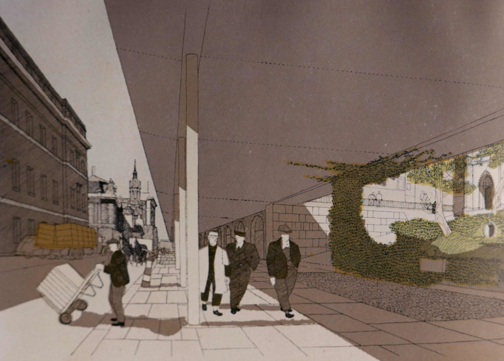
The following drawing shows the proposed high level road in Lower Thames Street with the ground level occupied by a service road and a pedestrian area …
This drawing is of the proposed low level concourse at London Bridgehead, just to the west of the Monument …
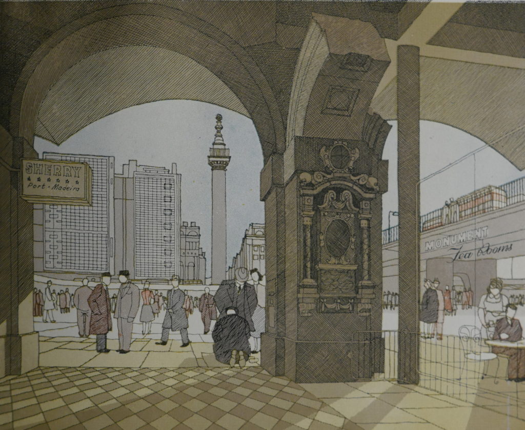
This is a clever piece of anticipation if you just swop the Sherry, Port and Madeira bar for a Wine bar and the Tea Rooms for a Cafe Nero. And nowadays men seem to be wearing hats again.
The following impression, also of the proposed London Bridgehead, is again (apart from the clothes) rather modern …
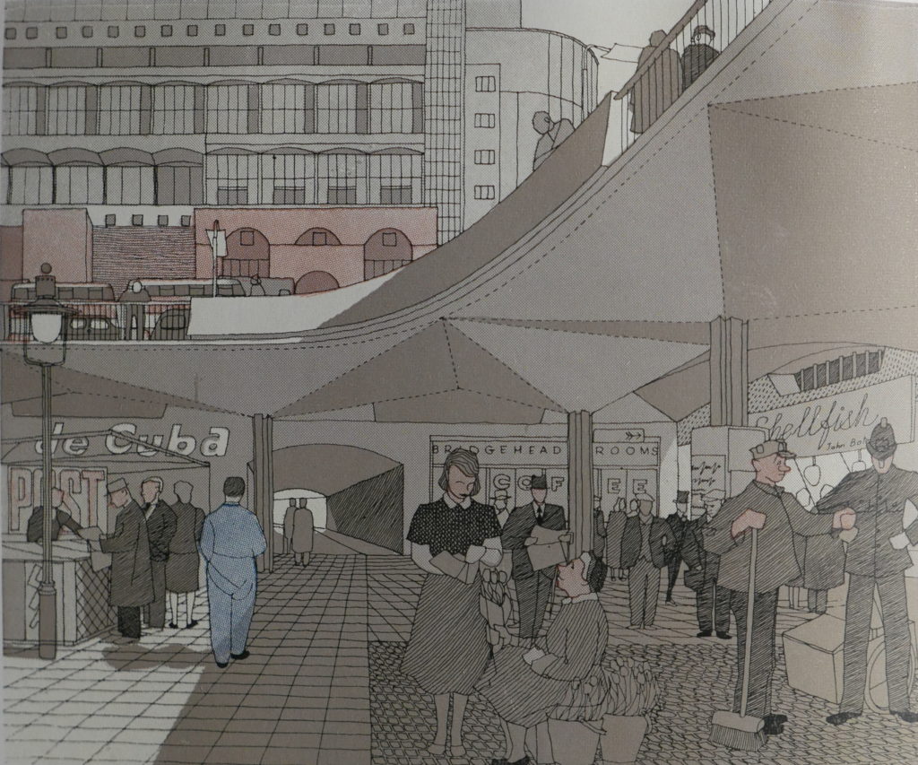
The report notes that the City is ‘chronically short of places to eat’ so no doubt the authors would be pleased to see how that situation has drastically improved.
The high level separation of traffic can be seen here as part of the large circulatory road system on the northern end of London Bridge …
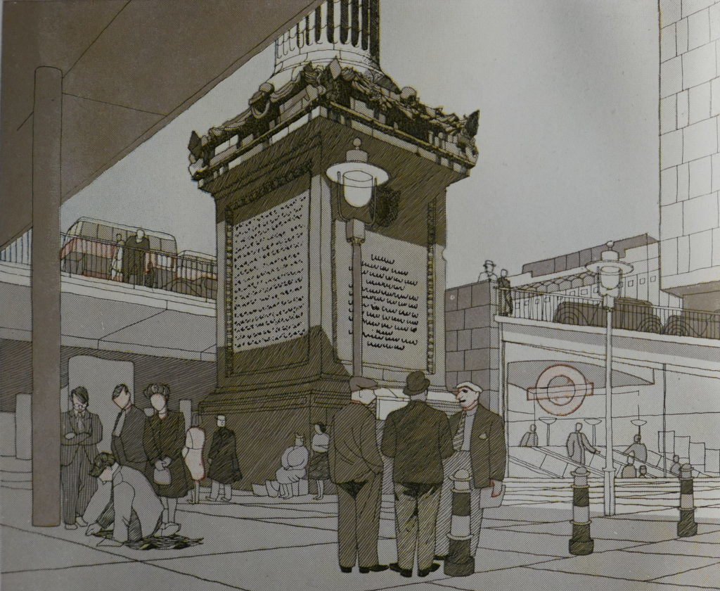
To the right is a glass sided entrance to the Monument Underground Station with the London Transport roundel on the side. This would have replaced the entrance on Fish Street Hill which today is an entrance directly on the ground floor of an office building rather than this rather nice, glass sided descent by escalator. I have to keep reminding myself that these ideas were being put forward over 70 years ago.
I really had to do a double-take when I saw this drawing entitled ‘An impression of a possible treatment of the proposed new approach to St. Paul’s from the river.’
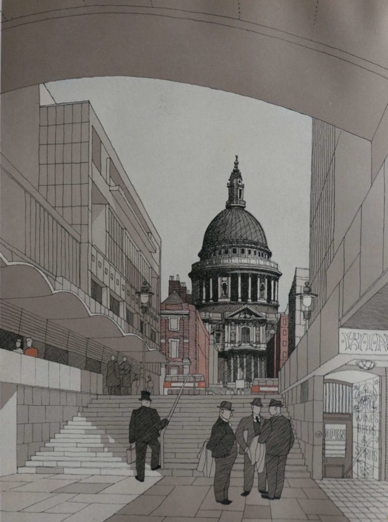
And now we have a similar view after we cross the Millennium Bridge (however we are unlikely to spot a man in a top hat).
Just to show that not all the recommendations were attractive, a picture entitled ‘An impression of the suggested Cheapside Underpass, a proposal which has been postponed on grounds of cost.’
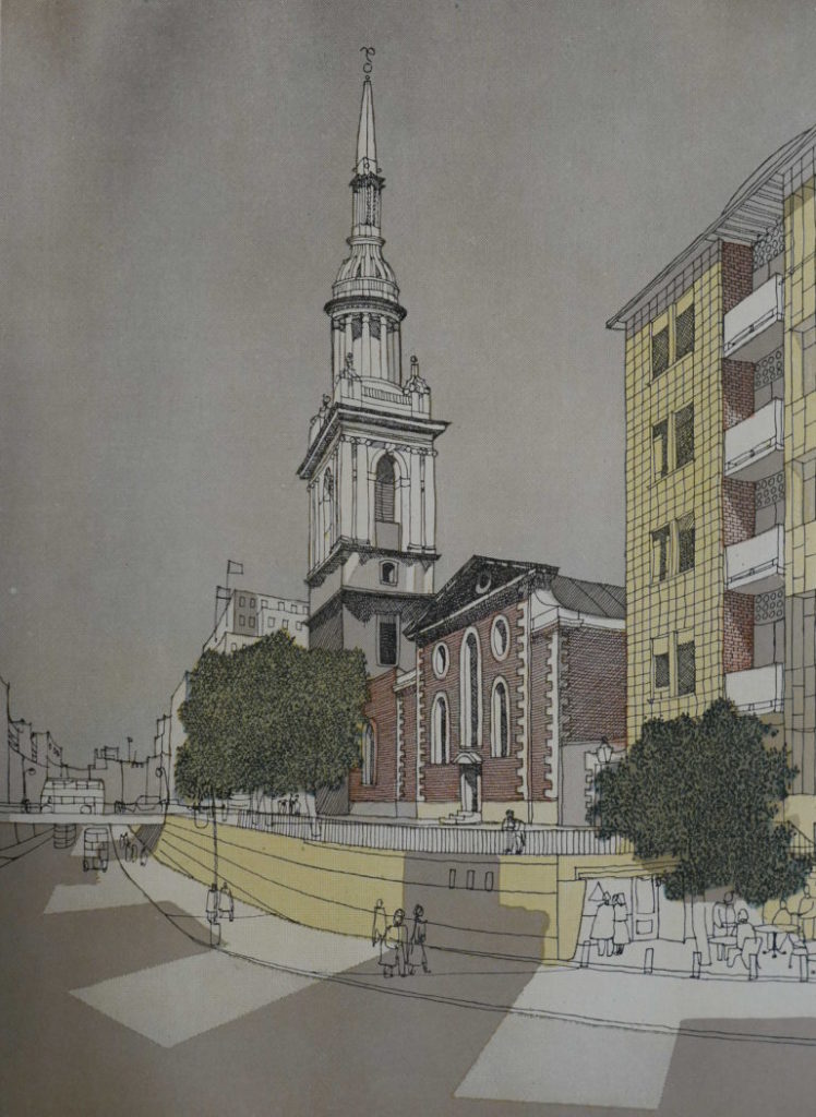
I think we had a lucky escape there.
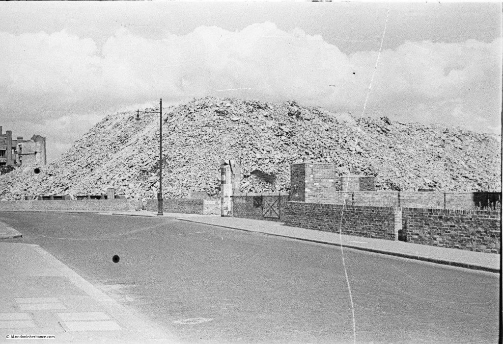
And finally, a reminder of the utter destruction the War brought to some parts of the City. A photograph taken by the blogger’s father showing a very large pile of rubble following the demolition of bombed buildings in Aldersgate …
I hope you enjoyed today’s blog – apologies to those of you who already subscribe to the London Inheritance blog and have therefore seen these images before. If you don’t subscribe and are interested in London’s history I can’t recommend it more highly.
