Walking the City of London

Month: September 2019

City Alleys in Black and White

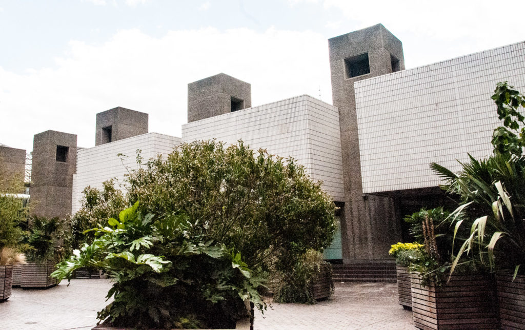
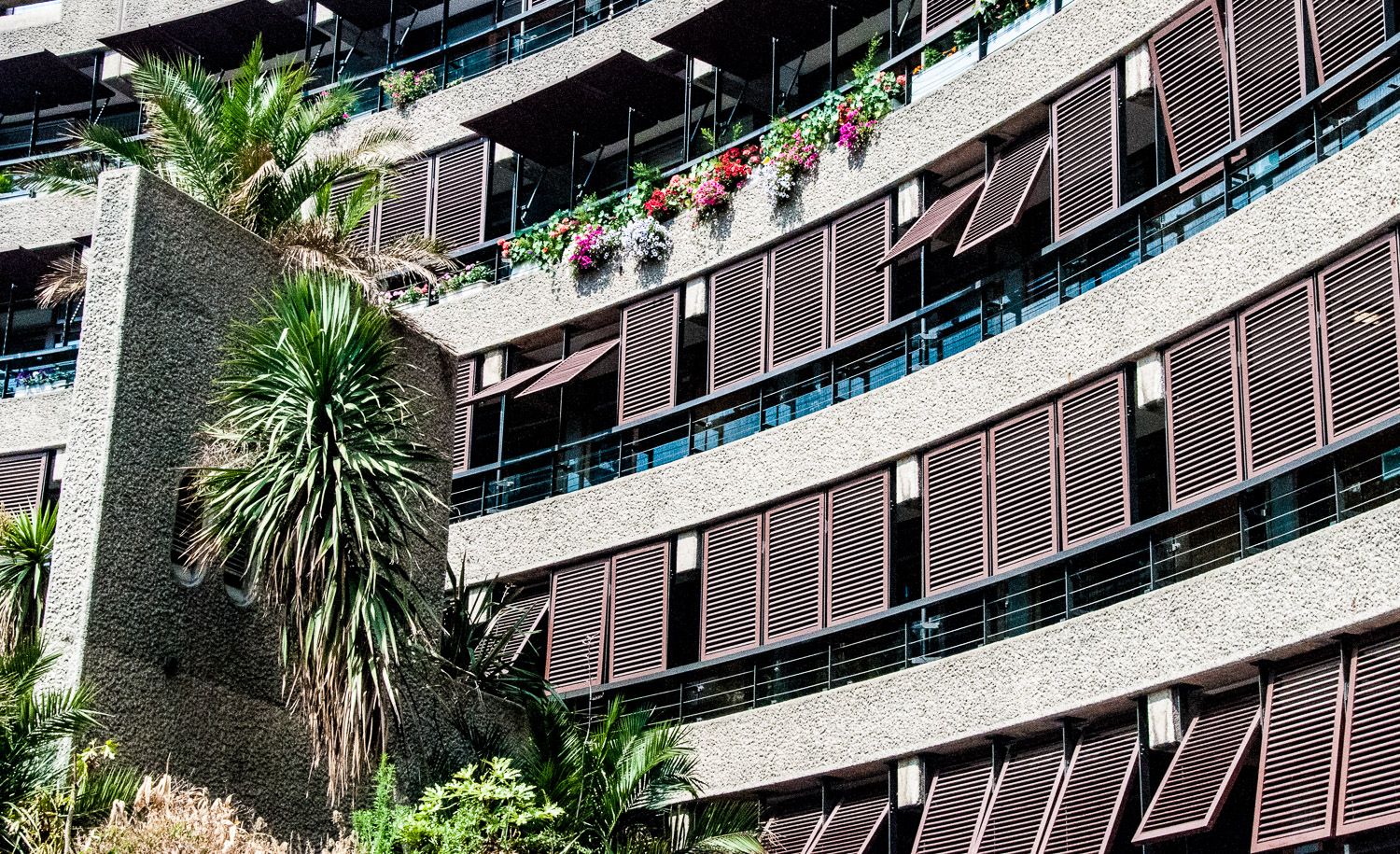
I try to take all the blog pictures myself and have been exploring the idea of using monochrome where it might produce a better, more atmospheric image. With this in mind, for this week’s blog I have revisited the pictures I took of City alleys some time ago. The commentary may be familiar to you from the earlier writings but I hope the stories are worth revisiting.

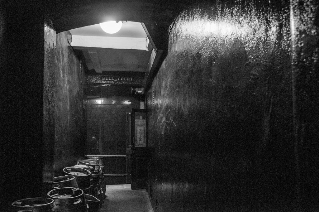
The entrance to Ball Court looks decidedly sinister …

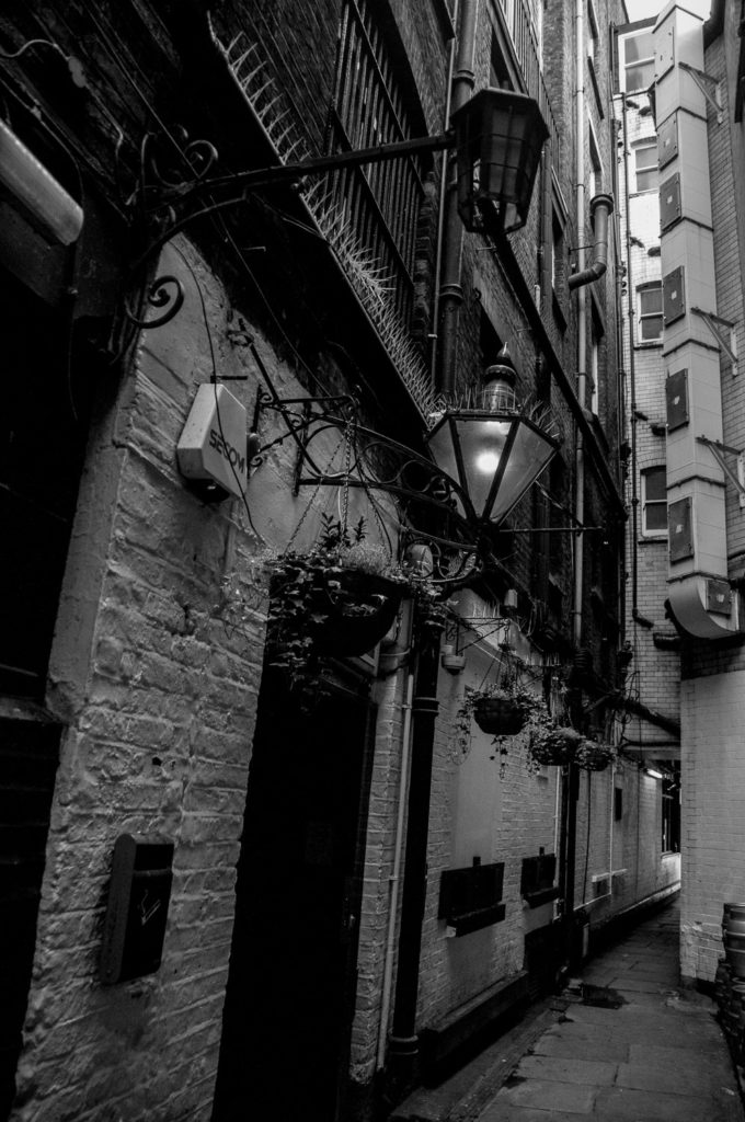
There are two alleys off Bishopsgate that are quite easy to miss but reward investigation. The first I explored was Swedeland Court (EC2M 4NR). I can’t find out why it’s called that (or why it’s a ‘court’ and not an ‘alley’). At the end is the interesting Boisdale Restaurant. It’s worth walking to the end and looking back towards the street as there are some charming old lamps and it’s very atmospheric …

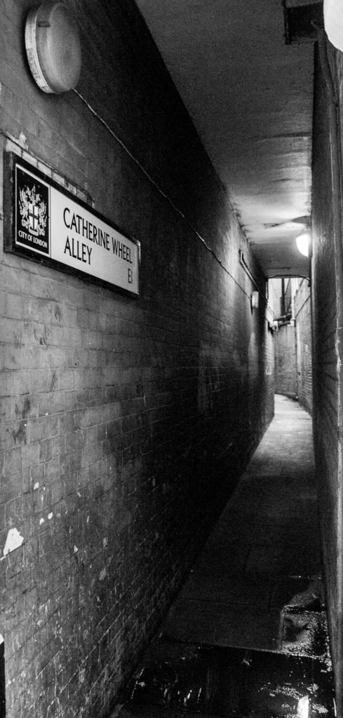
Nearby is the rather uninviting looking Catherine Wheel Alley which will eventually lead you to Middlesex Street …

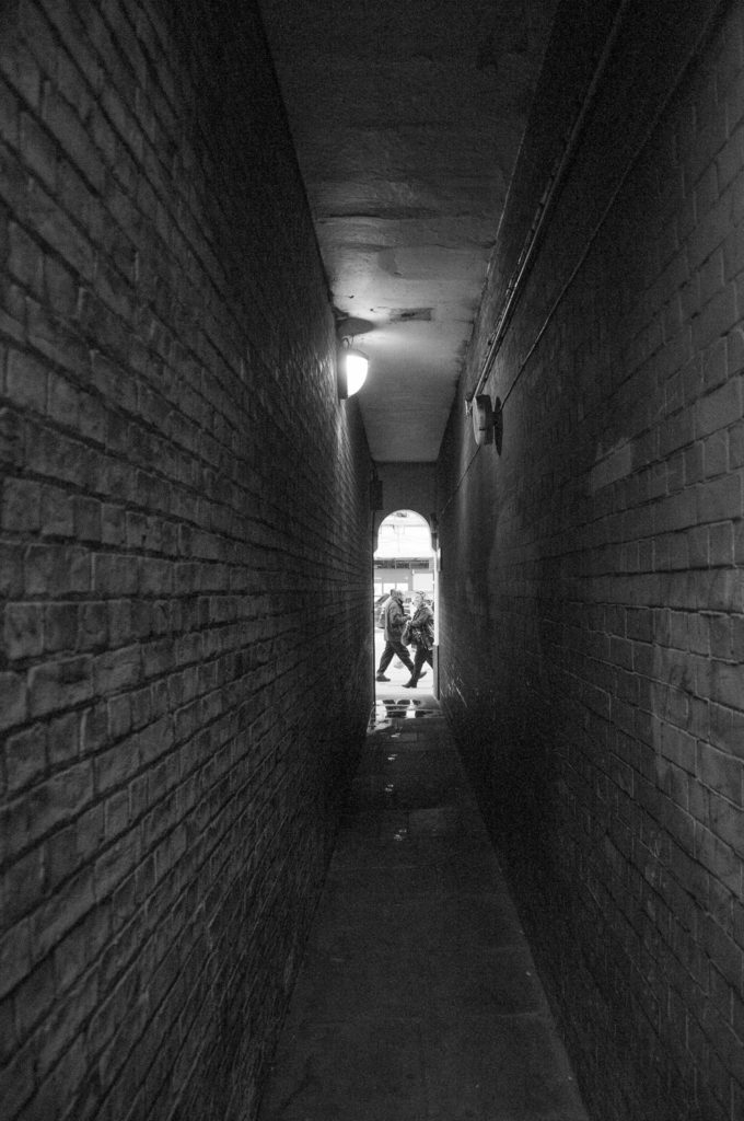
Looking out towards Bishopsgate …

The Catherine Wheel pub stood here for 300 years until it burned down in 1895. It’s said that the name was changed at one point to the Cat and Wheel in order to placate the Puritans who objected to its association with the 9th century saint. It’s also claimed that the highwayman Dick Turpin drank here, but if he drank in every pub that has since claimed a connection he would never have been sober enough to ride a horse.

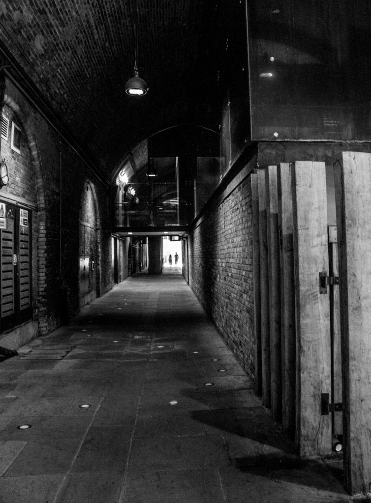
When I worked near here in the 1970s it was always a pleasure to walk through this covered passage since the enclosed area was redolent with the aroma of spices, once stored here in the heyday of London Docks. It had the nickname ‘Spice Alley’ …

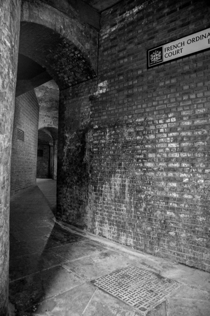
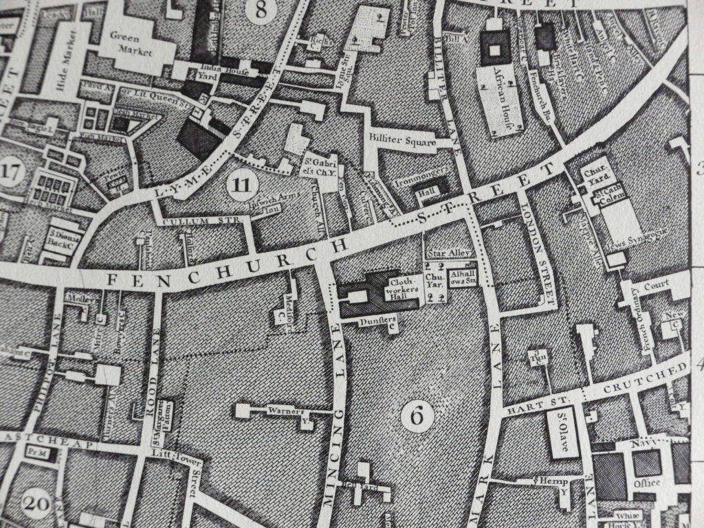
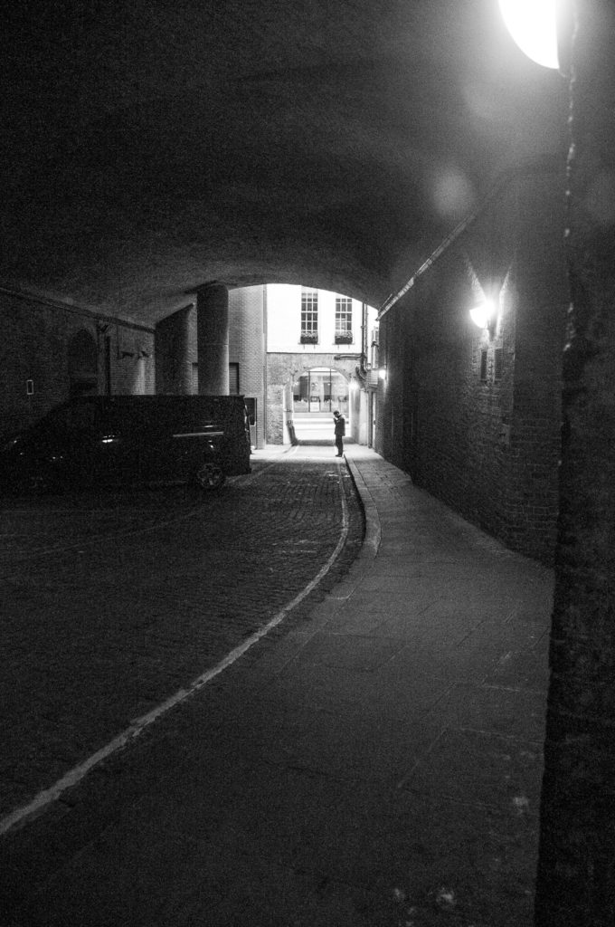
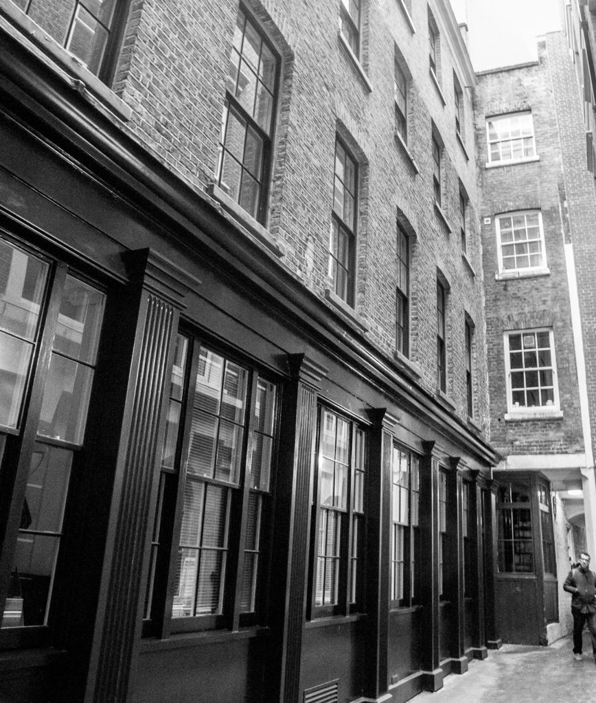
The pathway from Fenchurch Street (just beside the East India Arms EC3M 4BR) leads to Crutched Friars and by the time of Rocque’s map of 1746 it had acquired the name French Ordinary Court. The Court was named for the fact that, in the 17th century, Huguenots were allowed by the French Ambassador, who had his residence at number 42 next door, to sell coffee and pastries there. They also served fixed price meals and in those days such a meal was called an ‘ordinary’ …

John Rocque’s map of 1746

The lane itself dates from the 15th century and perhaps even earlier. It was further enclosed in the 19th century as Fenchurch Street railway station was constructed above, transforming it into a cavernous passage.

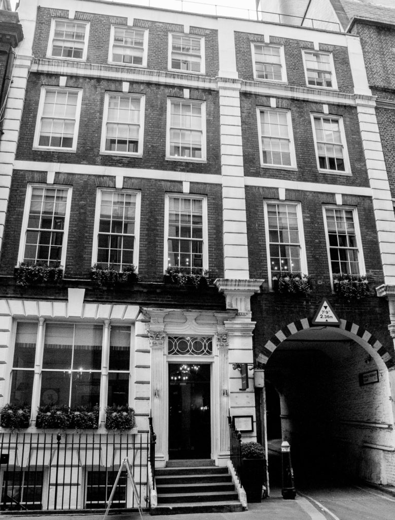
The old French Ambassador’s house …

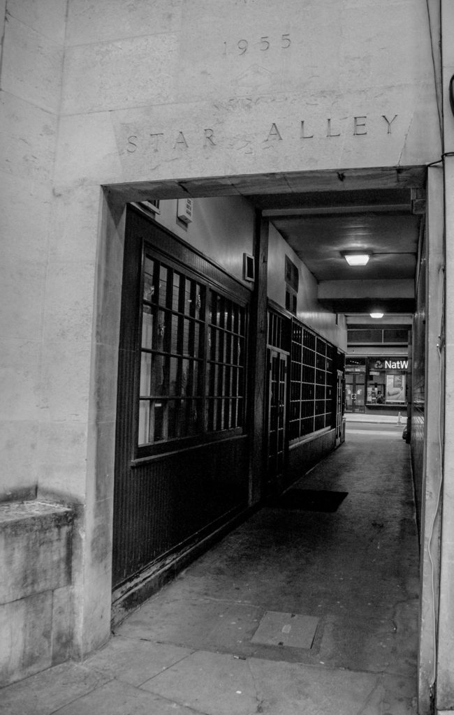
Star Alley (EC3M 4AJ) links Mark Lane with Fenchurch Street and you can also find it on Rocque’s map …

The wooden facade of the restaurant makes it look much older than 1955.

This is the entrance to Bengal Court …

Squeeeeze through and you could be back in the 17th century …

It was common at the turn of the 20th century for offices to have mirrors installed and hung outside to reflect light. I have come across this picture which is captioned Bengal Court 1910

Copyright Collage – The London Picture Library Record 36020

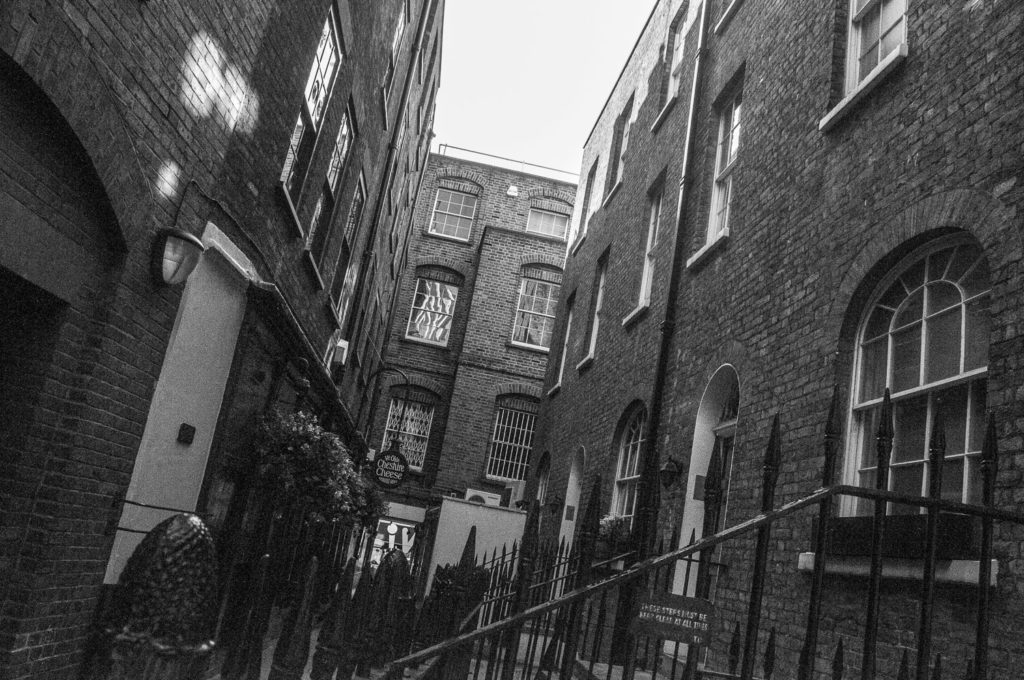
Wine Office Court off Fleet Street is home to the Ye Olde Cheshire Cheese pub, Ye Olde being an accurate description in this case since the pub dates from 1667. It also lives up to expectations inside, being spread over four floors with numerous nooks and crannies …

Looking north towards Fleet Street

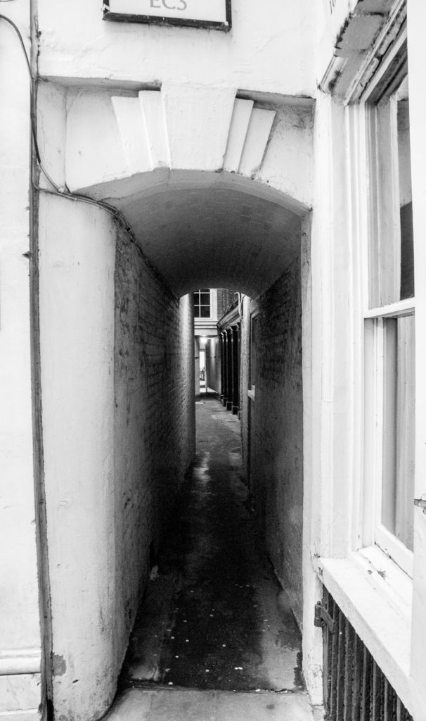
For a slightly threatening atmosphere it is hard to beat Clifford’s Inn Passage …

On the right you can see a ‘deflector’ designed to discourage men using the alley as a toilet since it would all splash back on their boots.

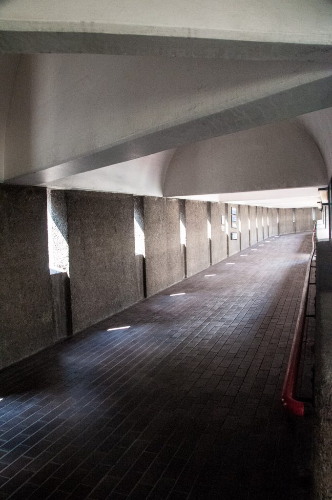
Steelyard Passage runs under Cannon Street Station and rather spookily there is a sound installation of the noise made in a steelworking environment …

Apparently the lights on the floor show roughly where the River Thames lapped before it was embanked.

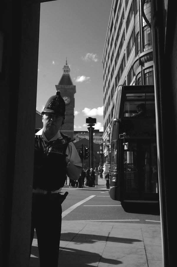
And finally, if you decide to do some exploration yourself, do bear in mind that you might arouse suspicion …

My Barbican Architecture Tour Part 2

In last week’s blog I talked about cruise liners and curves. This week it’s castles, crenellations and concrete (I am familiar with the rule ‘always avoid annoying alliteration’ but I just couldn’t help myself).

‘Barbican’ used to be the name of a street in a bustling commercial area in the ward of Cripplegate. By the end of the 19th century it was the centre of the rag trade and was home to fabric and leather merchants, furriers, glovers and a host of other tradesmen. You can see it on the so-called Agas map of 1633 …

On the 29th December, 1940, at the height of the Second World War, an air raid by the Luftwaffe razed virtually the entire surrounding area to the ground.

The word (from Old French: barbacane) means a fortified outpost or gateway, such as an outer defence to a city or castle, or any tower situated over a gate or bridge which was used for defensive purposes. And it’s easy to spot the architects’ references to that function as you walk around the 35 acre estate.

What about this entrance to the art gallery …

Those steps look formidable, and those crenellations (aka battlements) look like they are there to house a castle’s defenders.

Inside the walls are thick and the gates ready to be clanged shut against intruders …

More battlements look down on the Sculpture Court …

Where you can also spot some slits for archers to use …

Along the highwalk the archers’ reference is even more obvious …

It can also be seen on the extraordinary pyramid-topped entrance on Aldersgate, and even the bridge looks like a defensive structure (I’m thinking World War 2 pill boxes) …

Interesting shadows form at certain times of day …

The architecture responds very well to being photographed in monochrome, for example these crenellations at the top of the towers …

And this vertiginous view …

There are three flats per floor arranged within a triangular plan. Entrances, circulation spaces, lifts and escape stairs are in the centre of the tower.

These classical looking columns appear to support the structure …

The Barbican is the best surviving example of the post-war plan to separate pedestrians and traffic using raised pavements, rather clumsily called ‘pedways’. The plan failed due to a combination of the need to protect listed buildings, lack of coordination and the public’s reluctance to climb away from street level and embrace a new elevated world.

You can observe this part of the highwalk stopping in mid-air, its further progress into the City impeded by the wall of the Museum of London …

The often-derided yellow line was painted to help visitors navigate their way to the Centre …

Gilbert Bridge

It reminds me of a drawbridge over a moat since I saw it from the east end of the estate …

There was a plan at one time to run a road through the development roughly where Gilbert Bridge is now in order to preserve the north-south access lost in the bombing. Needless to say the architects objected and their argument prevailed.

The architecture here is often described as Brutalist, the term being derived from the French béton brut, meaning raw or unfinished concrete. Although the concrete at the Estate was left exposed, it was not unfinished, having been pick-hammered to give it a rough, rusticated appearance implying a sense of monumentality. You can see examples of raw and pick-hammered concrete side by side at the entrance to the Conservatory …

Getting the desired effect was incredibly labour intensive. After the concrete had dried for at least 21 days, workers used handheld pick-hammers or wider bush-hammers to tool the surface and expose the coarse granite aggregate …

We were told that the hammering needed for the entire Estate, including the towers, was carried out by a team of only six men.

Our tour guide not only imparted information about the architecture but also lots about the history of the Estate and the surrounding area. Highly recommended! It’s free and you can book on the website.

Cruise liners and curves – my Barbican architecture tour Part 1

Last week I finally went on a Barbican architecture tour and boy was it fascinating, and as an added bonus has given me enough material for two blogs. If you live or work near the estate, or attend performances here, do please have a look and hopefully you will find it interesting enough to make you want to come and explore. The architects were Chamberlin, Powell and Bon and the Barbican was their Utopian vision and masterpiece.

Standing on the terrace by the lake, our attention was drawn to the fact that Defoe House bore a distinct resemblance to a cruise liner bearing down on us …

A comparison that became even more apparent as we viewed the building from the north side …

Do you see what I mean?

In another maritime allusion, the elegantly curved tips of the cantilevered balconies resemble the hull of a ship …

And don’t these ventilation shafts look like classic ocean liner funnels …

The layout of the apartments was designed to maximize the amount of natural light in the rooms that would most benefit from it. Bedrooms, dining rooms and living rooms are therefore positioned along external walls, while kitchens and bathrooms are placed against inner walls.

In 1963 this ran into a technical problem. The London County Council had recently passed bye-laws requiring all kitchens to have windows or equivalent ventilation. Many of the Barbican kitchens did not have ventilation so a deal was struck. Approval was gained when what had previously been called ‘kitchens’ were instead renamed as ‘cooking areas’ and designated part of the living room. You can read the full fascinating story here in Barbican Living.

There is another maritime connection. To make the kitchens as efficient and space-saving as possible, the architects took their cue from the compact design of boats and brought in Brooke Marine, a firm of yacht designers. A full-size mock-up of a kitchen was erected by the Gas Council, Watson House Research Centre, and was tested by going through the motions of preparing several different kinds of meals.

Very good quality hardwood was used for the windows and their surrounds and the wood was painted with clear varnish. The overall effect from a distance is to give a warm honey colour to the buildings …

This fragment of the Roman and Medieval wall survived the Blitz …

Note the barrel vault roofs of the top floor flats, a feature widely employed in Roman architecture …

I noticed these curving stairs complementing one another …

Part of the site was occupied by railway yards before the wartime destruction. The architects have acknowledged this by inverting the curved brick arches that were once a feature of the area and using them to frame the windows …

The architects loved Venice and cited the canals, bridges and pavements of that city as the model for the pedestrian systems of the Barbican, describing it as ‘the best example of a city where foot and service traffic is completely segregated. This segregation,’ they continued, ‘has worked admirably for many centuries and there is no good reason why the principle should not be applied equally effectively in the City of London’.

There is lots of water, interesting reflections and great views, like this one from Gilbert Bridge as you approach the Centre entrance. Note the pretty circular ‘igloos’ covered in their Summer plumage …

And the wooden shutters on Frobisher Crescent look like they belong in more sunny climes …

Chamberlin, Powell and Bon’s original plans featured five tower blocks of twenty stories. These designs were rejected by the planning authority, primarily on the grounds that the scheme had insufficient outdoor space. In response, the architects reduced the number of tower blocks to three in order to minimize the buildings’ footprints. At the same time, they more than doubled their height to maintain housing density, making them for many years the tallest residential towers in Europe.

All three tower blocks and the majority of the terrace blocks stand above the podium on piloti, enabling pedestrians to navigate the estate unimpeded by buildings …

Occasionally you can also catch some interesting reflections …

The architects admired, and I believe corresponded with, the Brutalist architect Ernő Goldfinger and liked his idea of separating lifts and services from the main body of buildings. Our guide pointed out this example on the Estate …

Sometimes I think taking images in monochrome works best.

By way of comparison, here is one of Goldfinger’s most celebrated buildings …

Goldfinger’s Trellick Tower in Kensal Town west London – picture copyright ArchDaily

In 1964 the City of London Corporation presented the architects with a revised brief which demanded an expanded theatre and concert hall. The outcome of this was the Barbican Centre, a building which had to be shoehorned into the master plan after construction had already begun.

The theatre, to be used by the Royal Shakespeare Company, required a fly tower to accommodate scenery. The clever solution to disguising this feature above ground was the creation of the second largest conservatory in London after Kew …

Housing over 2,000 species of tropical plants and trees it a great place to visit. Opening times are limited, however, and it is sometimes closed for private events, so it’s best to check the website first to make sure you can get in.

And finally, they might not be exotic, bit I did like the look of these tomatoes that are being cultivated by a resident …

If you want to read more about the architectural history of the Barbican here is a link to an article that I found extremely useful and quoted often in this blog. It’s called AD Classics: The Barbican Estate / Chamberlin, Powell and Bon Architects.

I will be writing more about what I learnt on my tour in next week’s blog, but in the meantime you can find lots more pictures here when I wrote about the Estate and toured the Conservatory in July last year.

If you want to go on a tour (it’s free) here is the link to the website.

A visit to Aldgate East underground station

I know I shouldn’t encourage graffiti but, as I walked to the Station from Aldgate, I became intrigued by these carrots. The one in the middle looks really frightened – have one of the two on either side of it eaten his green topping? They certainly have scary teeth …

I think the space they look down on was the original site of Aldgate East tube station before it moved to its current location nestling under the Passmore Edwards Library

Next door is the Whitechapel Gallery with its pretty Tree of Life frieze by Rachel Whiteread which I wrote about in an earlier blog

Whiteread’s golden leaves.

I am visiting the station to see some fascinating tiles that date from the 1930s. You will see from the pictures that most carry the letter ‘S’. This stands for the artist and craftsman Harold Stabler, who was commissioned by the London Passenger Transport Board in 1936 to design 18 ceramic tiles to decorate new and refurbished underground stations. The first of the tiles were installed at Aldgate East when it was rebuilt in 1938 – this one represents the rearing horse from the coat of arms of the county of Kent …

They are not always easy to spot.

This is a great representation of London Underground’s headquarters at 55 Broadway …

Here is the building itself …

These birds are flying over water, representing the River Thames …

In this representation of the Palace of Westminster, there is a crown, a coronet and a bowler hat representing the Monarch, the Lords and the Commons …

This is from the coat of arms of the County of London …

The winged Griffin was the original symbol of London Transport. I can’t see an ‘S’ so possibly a later reproduction …

St Paul’s Cathedral (I can’t find the ‘S’ on this one either) …

Probably made specifically for St Paul’s Station.

This tile illustrates the coat of arms for the County of Middlesex …

The Crystal Palace …

And here the classic Underground roundel …

There is a more complete selection on the Bethnal Green Underground Station platforms which you can read about here.

Finally, I had to smile sadly when I noticed this optimistic piece of signage when I disembarked the train at Moorgate …

Powered by WordPress & Theme by Anders Norén