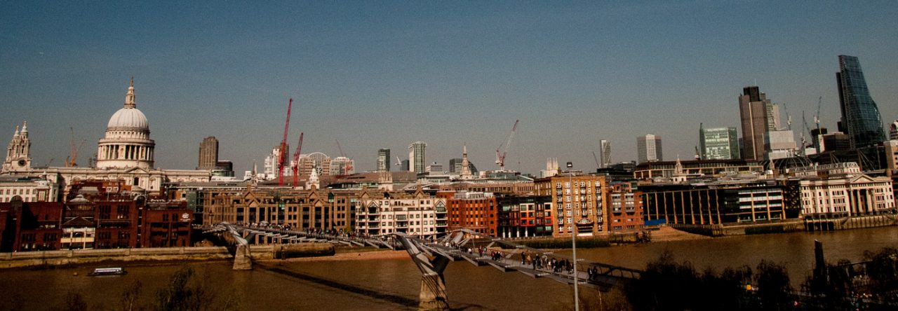
Last week I finally went on a Barbican architecture tour and boy was it fascinating, and as an added bonus has given me enough material for two blogs. If you live or work near the estate, or attend performances here, do please have a look and hopefully you will find it interesting enough to make you want to come and explore. The architects were Chamberlin, Powell and Bon and the Barbican was their Utopian vision and masterpiece.
Standing on the terrace by the lake, our attention was drawn to the fact that Defoe House bore a distinct resemblance to a cruise liner bearing down on us …
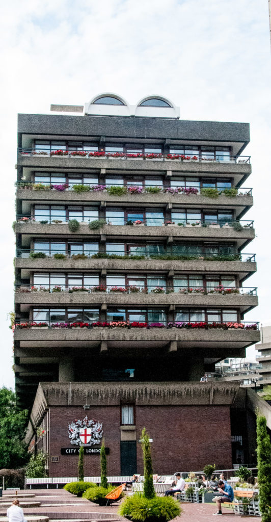
A comparison that became even more apparent as we viewed the building from the north side …
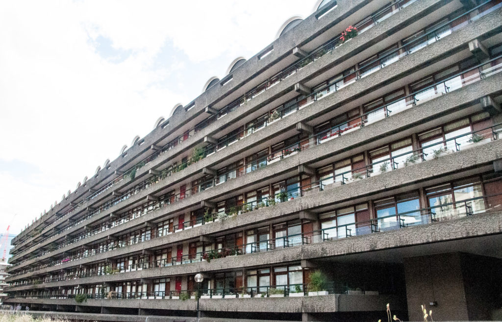
Do you see what I mean?
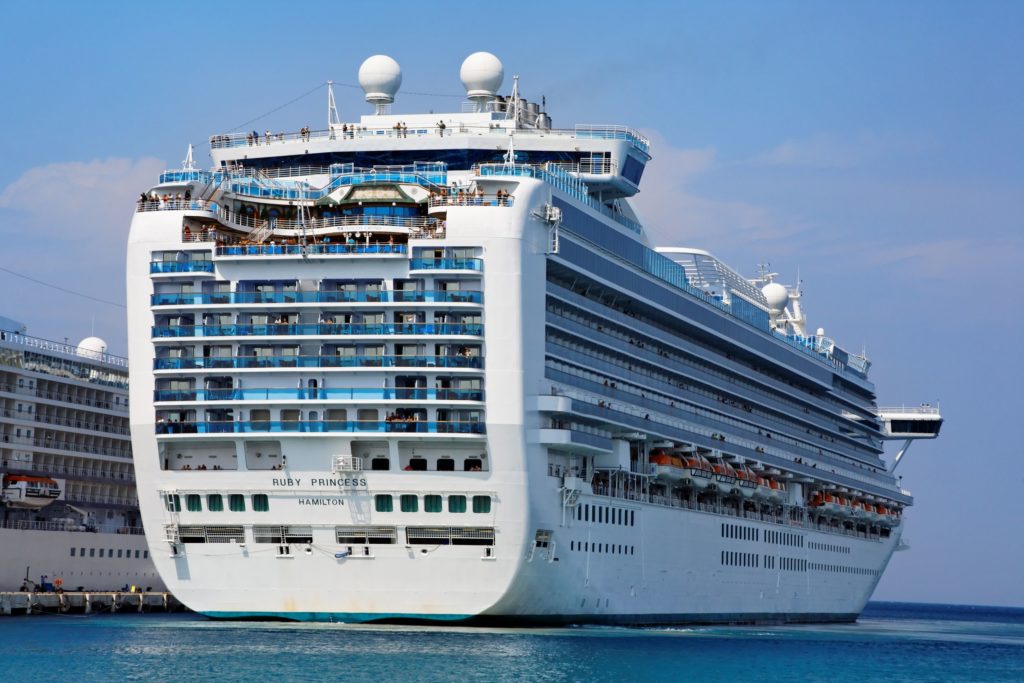
In another maritime allusion, the elegantly curved tips of the cantilevered balconies resemble the hull of a ship …
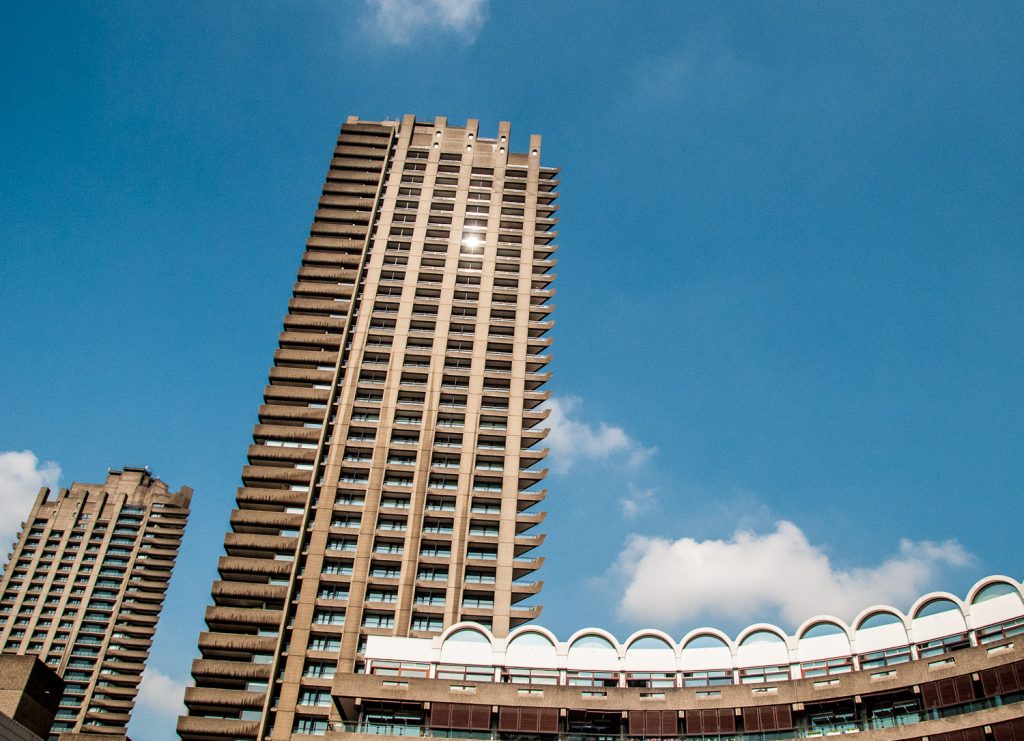
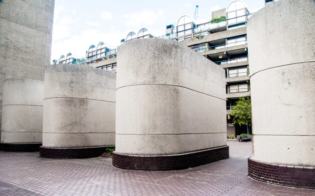
And don’t these ventilation shafts look like classic ocean liner funnels …
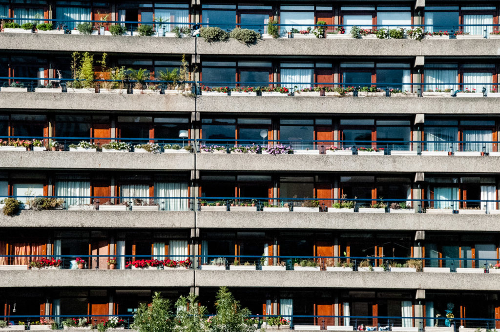
The layout of the apartments was designed to maximize the amount of natural light in the rooms that would most benefit from it. Bedrooms, dining rooms and living rooms are therefore positioned along external walls, while kitchens and bathrooms are placed against inner walls.
In 1963 this ran into a technical problem. The London County Council had recently passed bye-laws requiring all kitchens to have windows or equivalent ventilation. Many of the Barbican kitchens did not have ventilation so a deal was struck. Approval was gained when what had previously been called ‘kitchens’ were instead renamed as ‘cooking areas’ and designated part of the living room. You can read the full fascinating story here in Barbican Living.
There is another maritime connection. To make the kitchens as efficient and space-saving as possible, the architects took their cue from the compact design of boats and brought in Brooke Marine, a firm of yacht designers. A full-size mock-up of a kitchen was erected by the Gas Council, Watson House Research Centre, and was tested by going through the motions of preparing several different kinds of meals.
Very good quality hardwood was used for the windows and their surrounds and the wood was painted with clear varnish. The overall effect from a distance is to give a warm honey colour to the buildings …
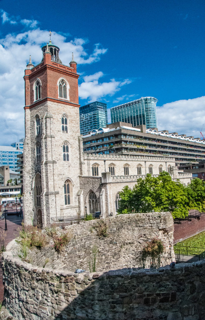
This fragment of the Roman and Medieval wall survived the Blitz …
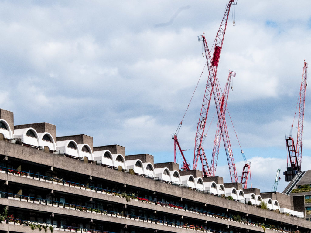
Note the barrel vault roofs of the top floor flats, a feature widely employed in Roman architecture …
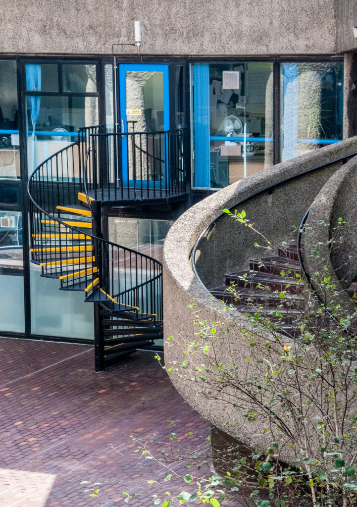
I noticed these curving stairs complementing one another …
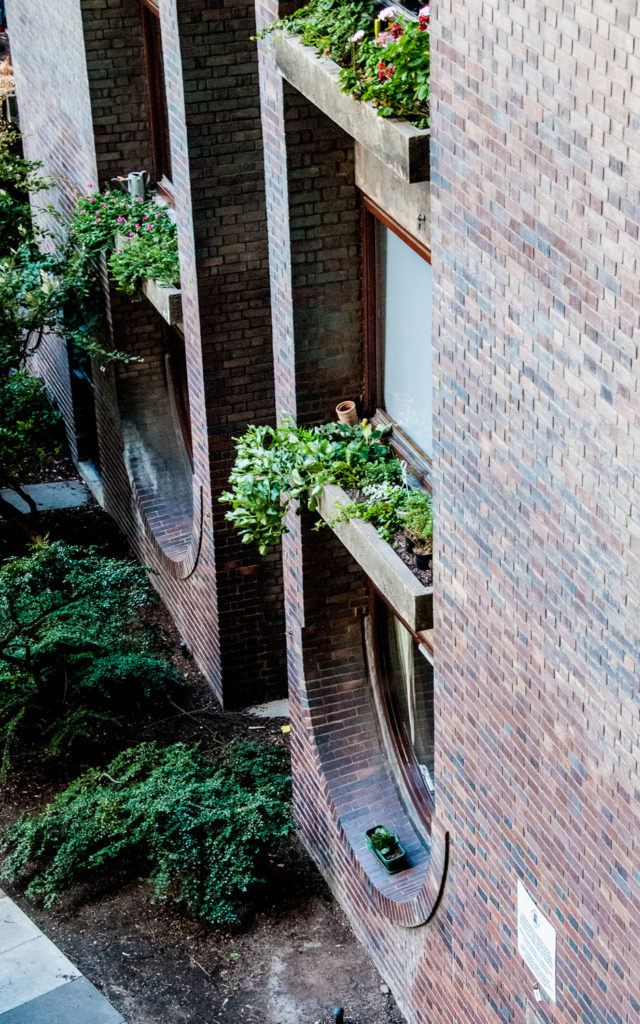
Part of the site was occupied by railway yards before the wartime destruction. The architects have acknowledged this by inverting the curved brick arches that were once a feature of the area and using them to frame the windows …
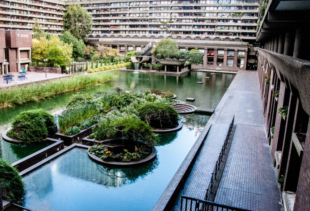
The architects loved Venice and cited the canals, bridges and pavements of that city as the model for the pedestrian systems of the Barbican, describing it as ‘the best example of a city where foot and service traffic is completely segregated. This segregation,’ they continued, ‘has worked admirably for many centuries and there is no good reason why the principle should not be applied equally effectively in the City of London’.
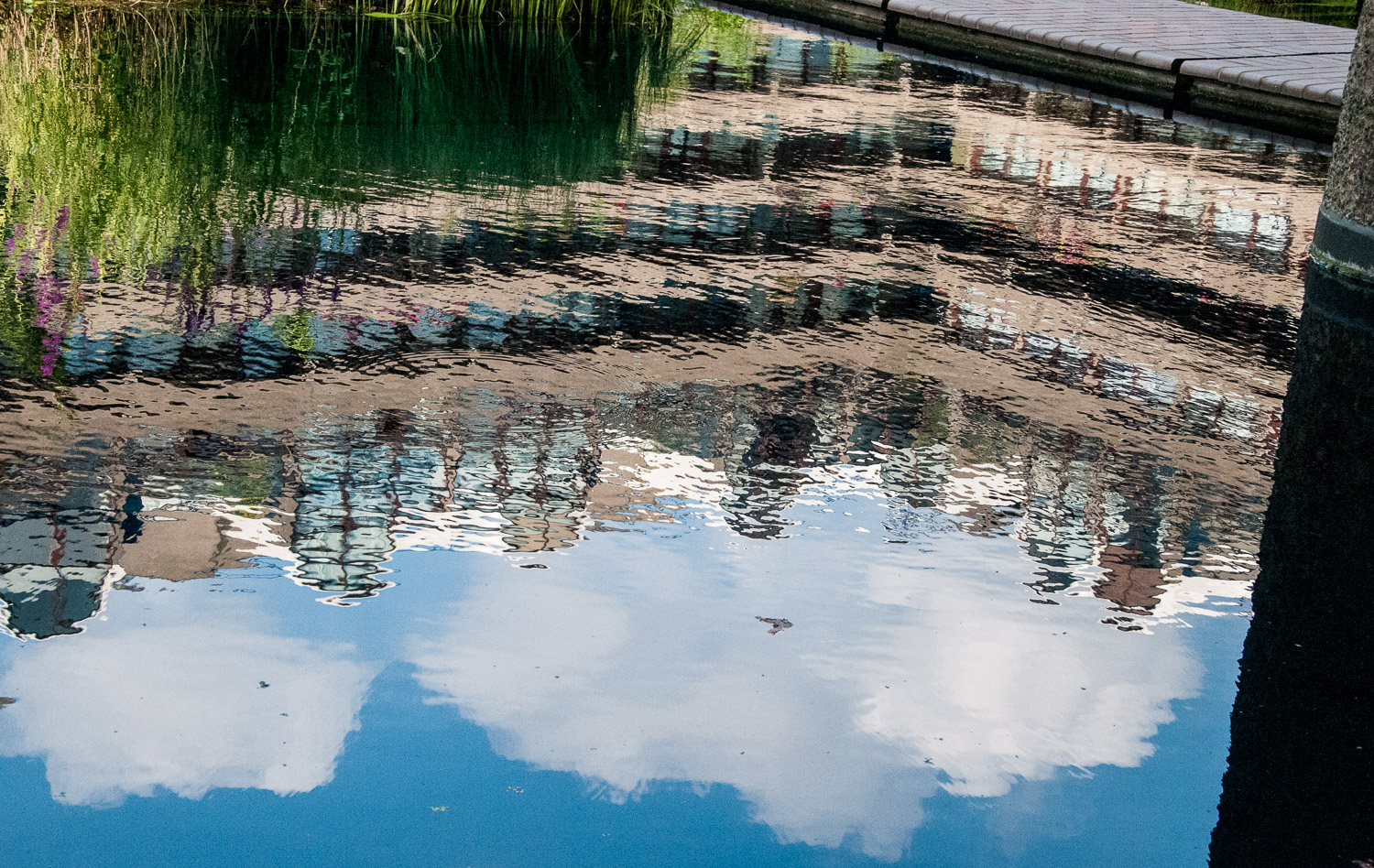
There is lots of water, interesting reflections and great views, like this one from Gilbert Bridge as you approach the Centre entrance. Note the pretty circular ‘igloos’ covered in their Summer plumage …
And the wooden shutters on Frobisher Crescent look like they belong in more sunny climes …
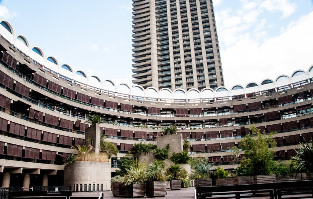
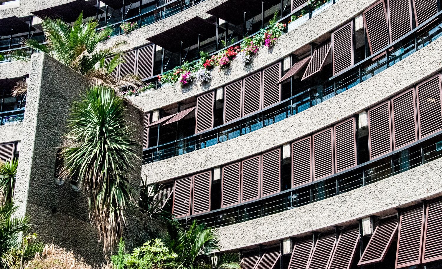
Chamberlin, Powell and Bon’s original plans featured five tower blocks of twenty stories. These designs were rejected by the planning authority, primarily on the grounds that the scheme had insufficient outdoor space. In response, the architects reduced the number of tower blocks to three in order to minimize the buildings’ footprints. At the same time, they more than doubled their height to maintain housing density, making them for many years the tallest residential towers in Europe.
All three tower blocks and the majority of the terrace blocks stand above the podium on piloti, enabling pedestrians to navigate the estate unimpeded by buildings …
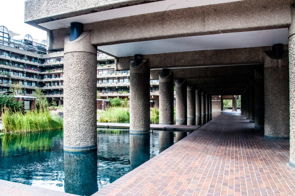
Occasionally you can also catch some interesting reflections …
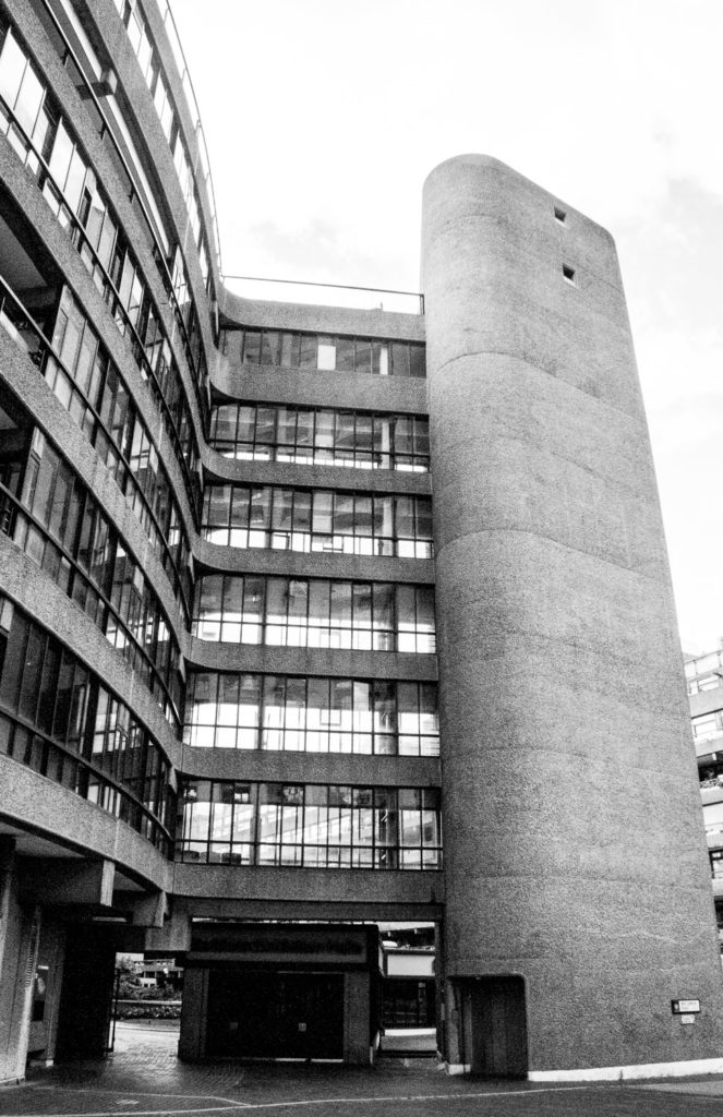
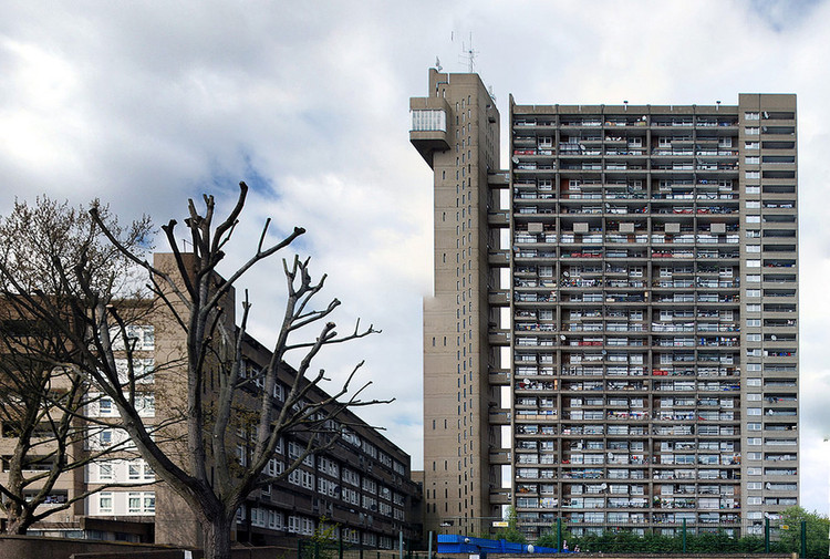
The architects admired, and I believe corresponded with, the Brutalist architect Ernő Goldfinger and liked his idea of separating lifts and services from the main body of buildings. Our guide pointed out this example on the Estate …
By way of comparison, here is one of Goldfinger’s most celebrated buildings …
In 1964 the City of London Corporation presented the architects with a revised brief which demanded an expanded theatre and concert hall. The outcome of this was the Barbican Centre, a building which had to be shoehorned into the master plan after construction had already begun.
The theatre, to be used by the Royal Shakespeare Company, required a fly tower to accommodate scenery. The clever solution to disguising this feature above ground was the creation of the second largest conservatory in London after Kew …
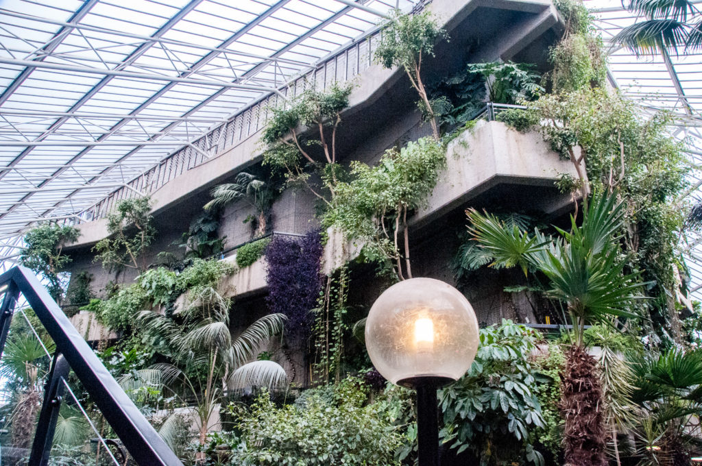
Housing over 2,000 species of tropical plants and trees it a great place to visit. Opening times are limited, however, and it is sometimes closed for private events, so it’s best to check the website first to make sure you can get in.
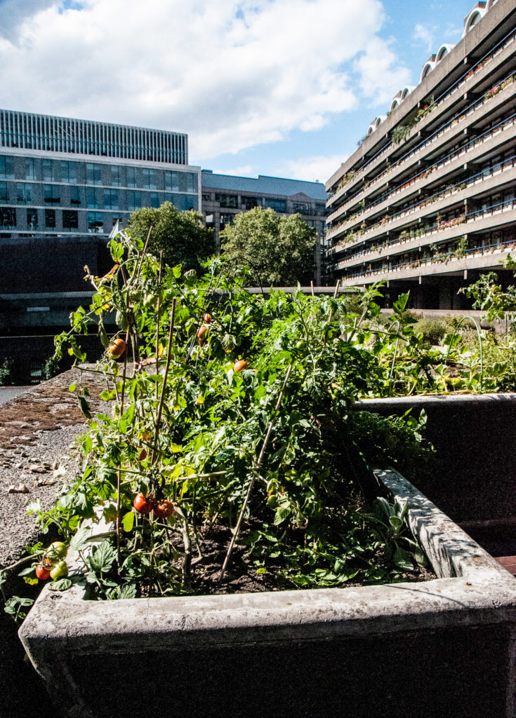
And finally, they might not be exotic, bit I did like the look of these tomatoes that are being cultivated by a resident …
If you want to read more about the architectural history of the Barbican here is a link to an article that I found extremely useful and quoted often in this blog. It’s called AD Classics: The Barbican Estate / Chamberlin, Powell and Bon Architects.
I will be writing more about what I learnt on my tour in next week’s blog, but in the meantime you can find lots more pictures here when I wrote about the Estate and toured the Conservatory in July last year.
If you want to go on a tour (it’s free) here is the link to the website.
